When did we Normalize Advertising Pints Using Twice As Much Ice Cream?
Hey, look, I know the pint is a weird, confusing unit of measurement that complicates the the simple fact that we’re talking about 16 fluid ounces — and yet, I’ll accept it as “convention.” But quick question: When did we normalize advertising pints using literally two pints worth of contents? I’m looking at you, specifically, ice cream industry.
Here is an example, courtesy of the Cheesecake Factory.
:no_upscale()/cdn.vox-cdn.com/uploads/chorus_asset/file/23420284/cheesecakefactory.jpeg)
And another, this time from the artisanal-leaning Van Leeuwen.
:no_upscale()/cdn.vox-cdn.com/uploads/chorus_asset/file/23420378/vanleeuwen.jpeg)
And yet another from the plant-based Coconut Bliss, the image for which is saved in the brand’s online media kit as “EDB-OverflowingPints-VanillaBrownieSwirl” (emphasis mine).
:no_upscale()/cdn.vox-cdn.com/uploads/chorus_asset/file/23420276/coconutbliss.jpeg)
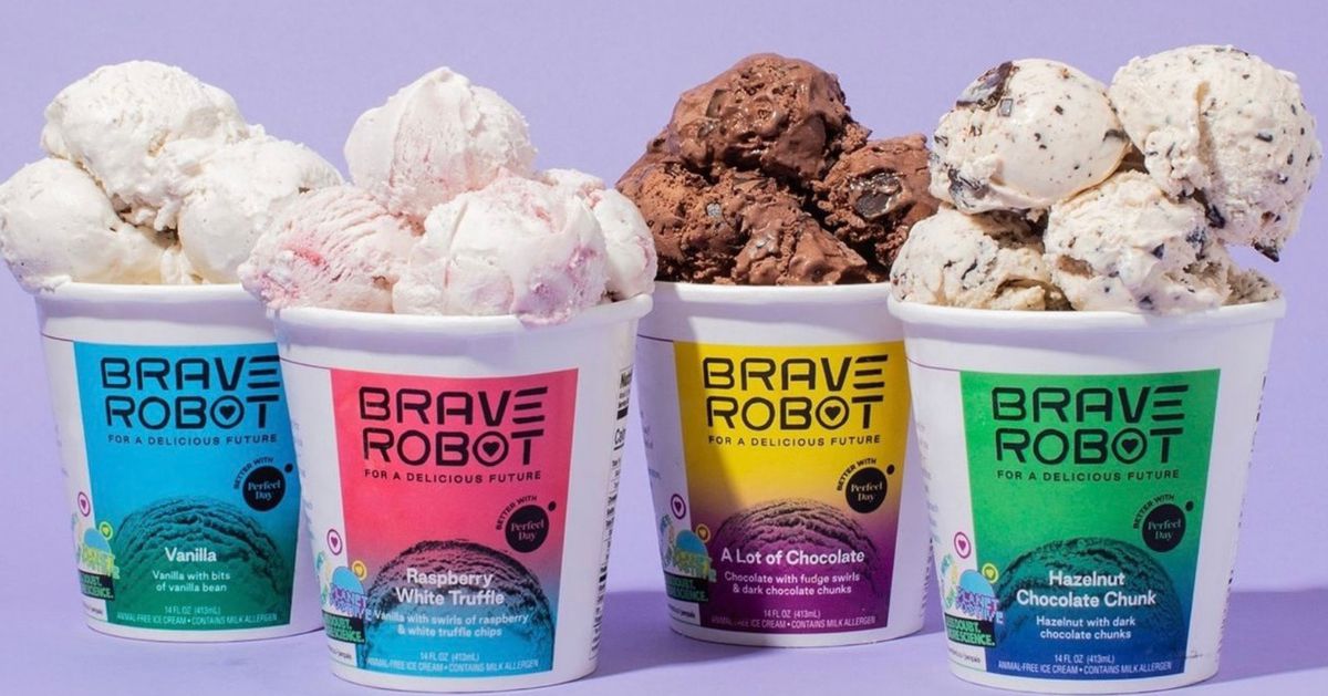
You don’t have to be a former ice cream professional like yours truly to see that this is a pint plus at least two more heaping scoops, if not three, and that for ice cream brands across the board, this form of literally over-the-top excess has become the dominant way of conveying that you’re selling a pint’s worth of ice cream. I’m pretty sure that’s not how measurements work! I am well aware of the size of these pints in real life — as well as the fact that these images may simply be digitally composed — but I resent the portrayal of food as wasteful spectacle, as evidenced by the very real 10-pound burgers and one-pound mozzarella sticks. And my initial oohs at the sight of interesting new flavors heaping out of the pint containers always give way to the ick of thinking about the reality of sticky, dripping ice cream.
The scoop creep extends beyond ice cream too. As snack expert Andrea Hernandez pointed out while responding to my tweet about this very thing, this overflowing pint aesthetic has tentacled its way into the cookie-dough-by-the-pint niche. And while writing this, I got an ad for Yishi, the Asian dessert-inspired instant oatmeal company, which portrays the heaping pint to an admittedly more restrained extent.
The most obvious rationale here is that an accurately filled pint doesn’t look very exciting from a photography standpoint, though ice cream brands have certainly found workarounds. Morgenstern’s shoots its pints lid-on beside a single plop of melting ice cream, or sliced in half to show a cross-section. Noona’s, though it sometimes veers into mountainous, above-pint-level territory, also accepts that we want to see what we’re actually getting, which is just a flat pint.
Like overflowing TikTok drinks and the whole “Freakshakes” thing, this styling choice is probably also rooted in a desire to catch people’s attention, and to dive into the sense of decadence. You’re already buying ice cream, so why not make it look especially indulgent? Or something. But please, let’s rein it back — we are testing the limits of physics!
